Book Your Consultation Today!
Our company takes pride in its capacity to meet its client’s needs and create flexible and scalable services and solutions that exceed current and future company requirements.
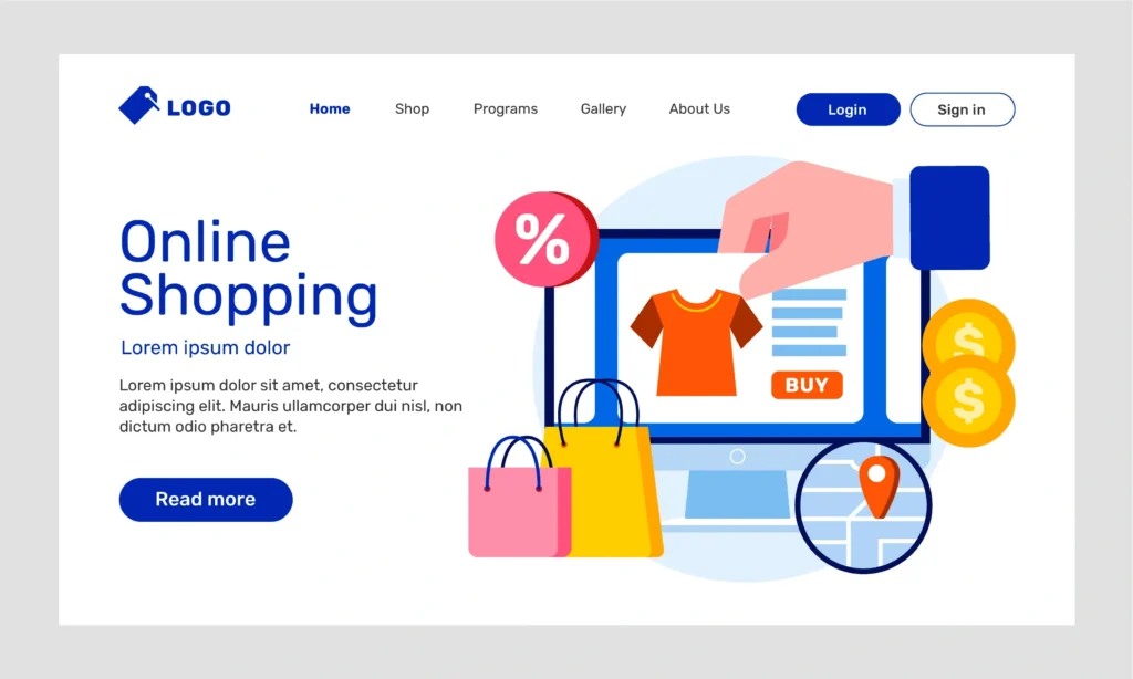
Nearly everyone looks up a brand or reads reviews about a product online. A business website is a storefront for potential clients and creates a public introduction to your brand. An eCommerce website gives good illumination to your offerings and draws profitability against competition and more clients. Selling online increases the chances of buying by a much larger audience, 93.5% of the world’s internet users have bought something online.
Having a website means better brand visibility to promote your brand. You’re visible to future clients. With this, you will be getting more traffic to your e-store or, at least, a lot of people learning about your brand, buying your products or services, and then sharing their extremely positive experiences through social media or reviews so that others will do so. This is how you set up a home-based business, accumulating loyal customers from around the world and not just your local market.
That is why website design and following the latest eCommerce website designs are crucial for eCommerce companies. It has a direct effect on people’s perceptions of your brand. It instantly gives visitors enough confidence to dig deeper into the experience they have as it encourages a visit and gives an impressive first look. All things influence each aspect, from how well it works to how it looks. All affect the user’s experience and in turn determines the user intervention and conversions.
Connect with us for best eCommerce Website Design
While there are pros and cons to a business adopting eCommerce, it can help in creating alternatives to traditional shops. You might, however, be tempted to just create a website and sell products from there, but what is it exactly that you know you are getting into? While eCommerce is great for many entrepreneurs, it may not serve as the ideal solution for your specific business.
These days having a professional website that is also easy to use is a must for any company planning to make its presence online? Many businesses are interested in hiring a web design company to create websites that convey their brand and differentiate them from their competitors. Let us now discuss the importance of keeping the latest trends in ecommerce website design.
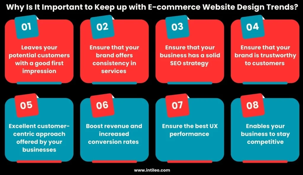
Your website represents your brand. It’s often the first touch point for prospective clients and thus reflects on your vision, values, and products. The best ecommerce website design creates an online presence and an opportunity for business success since it engages and communicates your brand message effectively.
Brand consistency applies to using the same visual components logos, colors, typography, photography, and messaging across all marketing platforms. These are aimed at building a unique and memorable identity for your company. Web design should incorporate all these components into its foundation for establishing an online presence to effectively relay the personality and values of your business.
Search engines would easily discover and rank your website if it has a well-defined layout. Hence, this will help your website to rank higher on the search results and eventually be visible to consumers interested in businesses like yours.
This should serve as the basis for the following KPIs for your SEO strategy:
A well-constructed website has more visitors showing an interest in your products by spending longer sails on your website, for it creates trust in what they see. This increases the chances of the visitor converting to a buyer or making sales.
Another way of gaining trust from visitors is by maintaining an open and transparent website that is open on its policies and offerings as well as its goods. By this, focusing on social proof, such as reviews and testimonials, may help create more trust within your website.
The best ecommerce website design reflects what your audience perceives as your customer values and services. A clean, modern, and approachable design gives a good first impression: that is, one is ready to serve new clients. An outdated website may dissuade prospective customers from finding out more about your products.
Enhancing the user’s experience, establishing trust and confidence, and improving the website’s optimal performance are attributes of transformation that an attractive website design does to increase users. An aesthetically appealing website makes it easier for users to interact with the material and perform the task of completing forgiven actions, such as making purchases or signing up for something.
Transforming the user’s experience, or building credibility and confidence, in conjunction with that of performance at the highest level, is what web design does to transform at the conversion level and, subsequently, into revenue. This is true in the cases where users are likely to interact with and do something through what they see most primarily which is making a purchase or signing up.
In making it easier and faster for people to traverse a website, web design components improve user experience and engagement. Overall, it enhances user experience. It is improved if you can ensure a good website design. It, in turn, reduces bounce rates, boosts engagement, and boosts conversions and income.
Some examples of what a well-designed website must incorporate in relation to improving the experience are:
A well-designed website is crucial. It enhances user experience. At the same time, it builds brand consistency, and enhances user impression. By offering accessibility features, quick load speeds, and simple navigation, it can also improve the user experience. Website designs can help firms stand out from the competition and get a competitive advantage in this way.
Get your dream eCcommerce Website Design
A website acts as a seedbed for lead nurturing and converting them. As for its design, ignoring it can stamp the whole sales, customer satisfaction, and even the reviews.
If you already have a live website, then go ahead to perform a site analysis and optimize for a better user experience. You can either rebuild an existing site or create a new one. While there, you can invest in another professional agency service. After all, they give insightful advice and also create a unique website design that gels well with your company’s objectives.
Here is a detailed and competitive analysis of the top 20 ecommerce website designs. It will give a detailed synopsis of the east web development trends. If you are a business owner, looking forward to hiring a web development company regarding eCommerce website development, the flowing trends will help you stay tuned.
Due to the more time users are spending on their gadgets, dark mode is becoming even more popular. This encourages users to spend long hours surfing the web, even in dim light, decreasing eye welfare fatigue.
By 2025 and further, almost all websites will have an in-built low-light user interface (UI) and dark modes as one of the standard features.
In addition to the modernization that dark mode gives to your website, dark mode also emphasizes the other elements of important design that you wish to highlight. Practically, low-light user interfaces are very useful for users on mobiles. Dark mode extends battery life because it reduces the amount of illumination emitted by the screen.

A dark background, gradient, or shadows can be ideal for your website design. You can even go for a light-dark edition of the site where visitors to your site can toggle it on and off between the two.
Consider the accessibility of the site as well as the best ecommerce website design when embedding dark mode into the web design. The sign of easy navigation with readable material is a must.
Basically, dark mode is changing a website’s hues from light to dark-white or light texts and icons put onto a black or dark gray background. It fulfills several benefits like:

Examples and case studies of Dark Mode-made websites
The Imotion Factory logo is among the creative elements that are easily observable on the website. The red dot next to their name is a clever yet understated method to establish them as a full-service video production company, as movie buffs would agree.
Best Features
Despite its fruity moniker, Avocado Systems is a company that specializes in application security. The company used an innovative approach in using a charming, mechanical, dark-themed design for their website.
Best Features
The majority of school websites have a simple layout that reflects the colors of the campus, however, Wroclaw University of Technology took a darker approach. Lama Media created their website, which is imaginative, modern, and has a dark theme, but it still pops in full color.
Best Features
The GD Stones site is designed in the same spirit as the brand. Absolute aced dark theme website with a marbled-textured background on bluestone98.
This mammoth intrusive type filling the entire screen doesn’t overwhelm, either by the whiteness or the yellowness of copywriting. Bluestone98 applies yellow for drawings or marking out such descriptions. Look at how the brand name is emphasized in yellow after the three copies of white in the header.
Best Features
89% of marketers confess that when they use personalized advertisements, they reportedly make a profit from them. In the year 2025, this personalization in user interfaces will be one of the most sought-after trends in web design, which is very much needed to keep visitors engaged with the site.
In effect, a customized user interface can enhance customer loyalty and conversion rates. Personalization might involve such factors as color schemes, layouts, and typography based on the profile of the visitor to the site. Customized dashboards and navigation will be common to suit a user’s workflow as well.
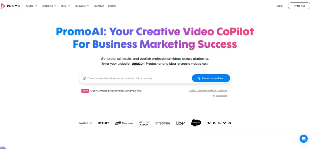
The incorporation of customization techniques demands a holistic approach that not only covers customer segmentation but also data gathering and analytics in web design.
To assess and gather demographic, user activity, and other most relevant information, to study how people use your site. The best ecommerce website design would also mean setting up a secured data infrastructure where this information could be stored.
Again, very much among the necessary prerequisites for effective targeted personalized efforts is a segmentation scheme that effectively divides specific customers into client segments.
Case studies and examples of personalized UI-designed websites
In the recent playback of the video creation platform, a UX designer Sascha had been hired to comb through the upgrade requirements of v2.0. Part of those who endowed it with new features, which had been able to still be part of the existing UX. This design was meant to focus on interface elements that were necessary for creating an easy-to-use platform.
Best Features
Some of the pressing issues found in popular productivity apps were summarized in the UX case study example, including poor UX and UI that resulted in difficult navigation. It also replaced poorly constructed information architecture and limited what users could do with the mobile application.
Best Features
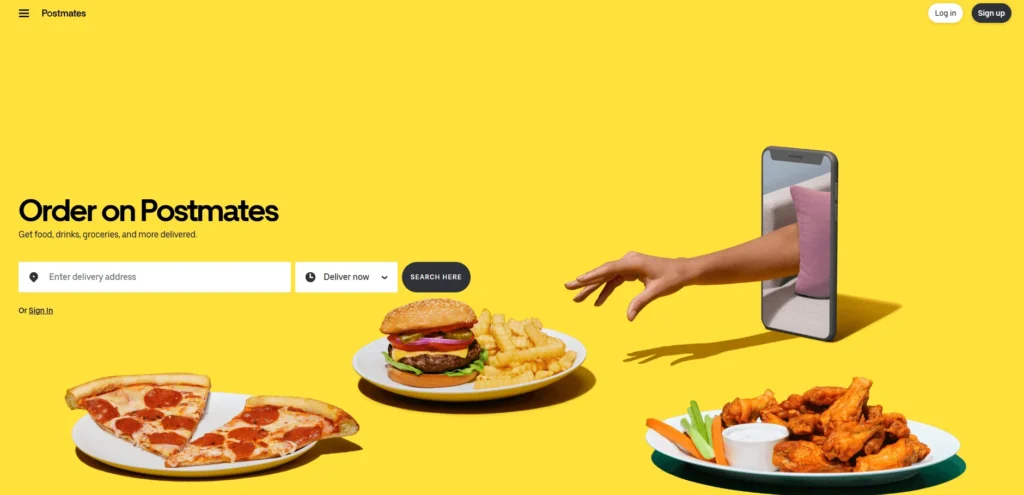
This case study enlightens on the evolution of the Postmates app while discussing it in brief. One of the objectives that were accomplished by redesigning was improving the experience of the app and the other UI components.
Best Features
It makes all clear about the present-day and intuitive design. By means of this function, the users can find and join communities based on interests. It has a bright and tidy appearance. When integrated with the best categorization, it gives a beautiful and appealing interface to the unique site.
Best features
Get your eCommerce Website Design with Latest Trends
A fantastic way to give a personal touch to your website would be a picture of your team when happy hour rolls around. As for that funny photograph, it may not be good enough for gauging 2025 web design trends. Rather, many businesses now have illustrations that adorn the pages.
When using an illustration, you can create the entire thing as detailed as you would like to capture that very specific emotional feeling and incorporate your brand colors. A unique artwork will then be stored in its user’s memory stronger than that of a picture of some unknown person.

Firstly, you don’t have to resort to illustrations if they don’t fit with the style of your website. Otherwise, graphics could also be a great way to achieve a current look during rebranding.
You can use illustrations as the main focus or highlight on certain pages. In any case, a hand-drawn touch can make your website really special.
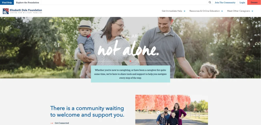
Case studies in of illustrations in web development
Accessibility, smartphone usability, and a more efficient application procedure were given top priority in the design. The end product was a contemporary website that flawlessly reflected Better’s brand identity by fusing a lighthearted tone with a formal one.
Best Features
Determining user personas, designing a simple, responsive layout, and putting the website into Webflow were all important components of the project. The user experience was improved by the custom drawings, dynamic micro-animations, and monochromatic color scheme. Third-party integrations and sophisticated filtering for job postings simplified communications.
Best Features
Developers have always known since the beginning of the project that innovative technologies were essential for them because they spoke to innovative individuals. They decided to go with Webflow, code-free, to build the whole thing up. Thus, they succeeded in setting up a platform that could easily be introduced into an editable and expandable application at one-tenth the usual cost of web development.
Best Features
The first thing the design team did was draft a guide for design enhancements. The platform’s main components were then updated, including necessary features like meal filtering for dietary restrictions and the option to stop delivery on holidays.
In order to assist Powermeals in identifying technical problems in crucial areas such as the payment flow, subscription renewals, or meal selections, engineers created an “anomaly-flagging” script.
Best Features
Those days are long gone when you simply pull stock photos in your article-the reader will know. Therefore, integrating GIFs into your content is becoming a main trend of web design for the year 2025.
It’s proven that the increased use of GIFs within pages engages users and encourages them to stay longer on your site. They not only contribute an additional design element indicating great UX but also entertain.
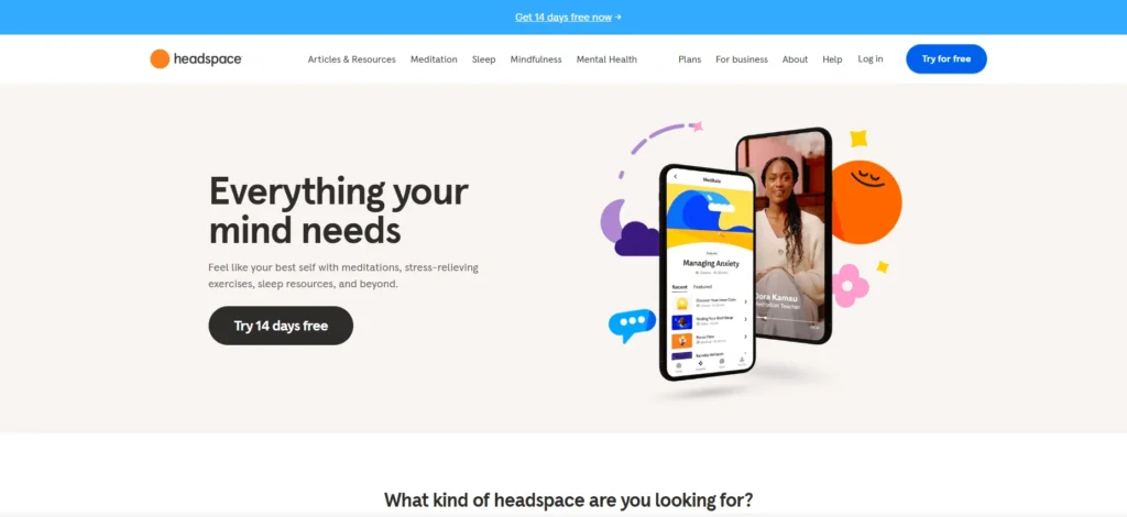
With Gyazo or something similar, you can create appealing attention-grabbing GIFs for a visitor to your site. When it comes to GIFs as part of the best ecommerce website design, the following has proven to be the best use:

Case studies in GIFs as graphics
The homepage serves as the perfect example of how one should use animated GIFs subtly yet skillfully. These images hardly add to the site’s overall impact while the black-and-white GIF sufficiently conveys the office setting and ideas behind inventive work and teamwork without being dramatic. Combining this GIF with the parallax scrolling and monochrome color scheme proves quite effective.
Best features
Professional GIFs and ecommerce website design templates are expertly integrated into Invision’s website. The site’s already stunning design is elevated to a new level with the addition of a little animation. With words floating above a stunning photograph, the page’s base has a flat style. GIFs of its prototyping tool in use can be found if you scroll down a bit. By seeing the mouse move around the application, viewers can better comprehend how it functions. It’s professional, easy to use, and efficient.
Best Features
Macaw is a web design tool used by professional designers and developers alike. The documentation for the application online is fairly concise and clean, with black text on a white background. If you keep scrolling down, you will find GIFs showing various parts of the design tool in action so you can feel what it would be like to use them.
Best Features
Giant Ant employs GIFs so subtly that it will take a long time to appreciate them. The main page has a delicate overlay of text and one simple image. Beneath the image lay cartoons of everyday objects that come alive in animated GIFs when you hover over them. This is a wonderful way to include a little bit of dynamic material into a website without going to all that more complex gymnastics or motion picture magic.
Best Features
Connect with us for your eCommerce Web Development
Animation has become another upcoming trend in web design for the year 2025. As stated above, an increasing number of websites include GIF-based animations in their content. They too perform animations in calls-to-action, on their homepage, and elsewhere.

Adding animations to your website is a terrific way to make it more lively in 2025. Don’t go overboard, though; just include animations on key sites, such as your main page. To prevent overloading the audience or degrading your usability, make sure you employ them purposefully.
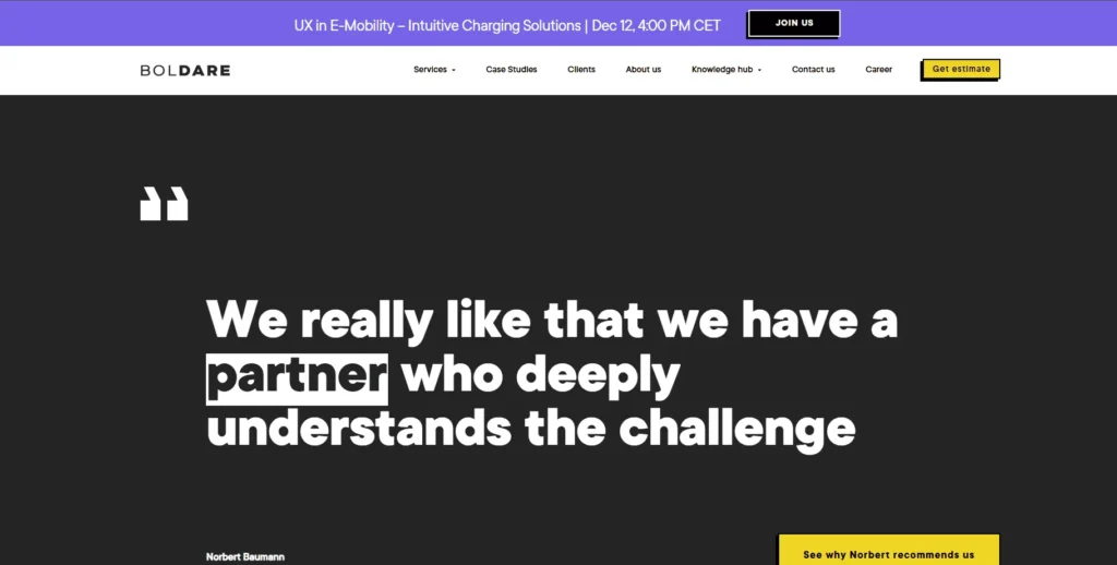
Case studies of animation-based websites
Ockom brings cybersecurity to individual customers by offering scalable and durable cyber resilience solutions. Such a website is considered simple yet attractive.
This highly interactive, user-friendly website was created by Digital Butlers web designers by cleverly embedding advanced animation technology within a simple user interface. This strategically positions the organization as a premier and highly reliable cybersecurity supplier.
Best Features
Affirmed to be the establishment of & Tea – the new handshake beverage company that originated in the year 2021. The dynamic website now created by es Design will also aim to get more customers besides embracing the profound mouth-watering brand image of &Tea and attracting new business.
Although the website belongs to &Tea, with modernity and pinpoint accuracy, it still bears some parts of its sector rivals’ old-fashioned conception. It’s sophisticated but not shy, classy but warm. It leaves an impression and evokes true relationships just as its delicious beverages do.
Best Features
QuadAngles is a well-known agency focusing on professional services, including creating brand experiences for mobile applications and web designs. Solely proving their acceptance of the above, their site shines with breathtaking displays of simple, parallax effects, animation, and ingenious use of negative space.
Best Features
The Planetarium web page of Boldare aims to help pet owners find out whether the plants they have are harmful or safe for their beloved canine and feline companions. How did the agency conceptualize the theme?
Much of the work done lovingly by Boldare staff goes into caring for all our furry creatures-they love animals and mostly have one or two for their company this is precisely why so much love, zeal, and education goes into making this website.
Best Features
Another one of the web designing trends of the year 2025 would be to show this connection with customers through social media networks like Instagram. One such example is American eagle’s #AExME campaign, where real customers are captured wearing their outfits.
The major advantage of this is that it turns out into a brilliant marketing strategy since it gives prospects a really tangible view of what their clothing would actually look like on a physical person rather than a model. It gives them ideas for how to style certain things. The campaign encourages them to consider mixing and matching branded tops with bottoms, putting some pressure on them to buy something other than just one item.
Before getting into a collaboration, have some user-generated content (UGC) for bringing the social channels into your web design. You can find amazing starter ideas from some really inspiring UGC campaigns by web developers to develop the best ecommerce website design.
Case studies in Instagram Integration on websites
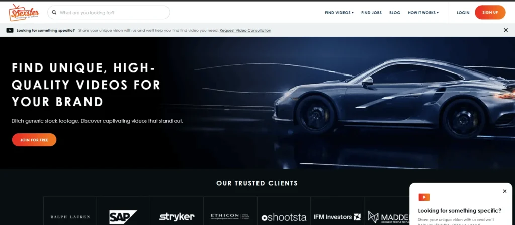
Advertisers can use this marketplace as a platform to look for pre-existing videos for their campaigns. They might give their branding materials to the videographer and ask for little tweaks to produce the finished result.
Best Features
Each product page stands out to show and underscores the unique product features while solving potential problems customers could face. It has a flexible design that will allow us to create future pages to be used as landing pages for other products.
Best Features
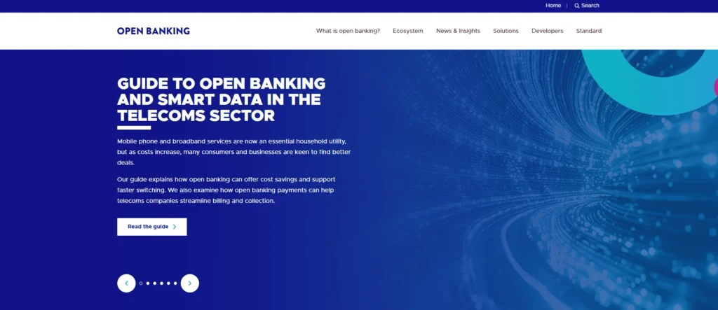
OBIE standards and software standards are therefore intended to motivate competition, innovation, and transparency within the UK retail banking industry. According to a CMA report, it has been hard for newer banks to enter and develop in the market.
Since 2018, the open banking ecosystem has enabled businesses and consumers to safely give access to third parties to their account information. Consumers use this information to customize their engaging services and applications to every unique customer’s financial circumstances.
Best features
Quality assurance, software development, and consulting are just a few of the many IT services that Aspirity Tech provides. They used ColorWhistle for a full-service website development. It included web design and a logo. The business desired a website with a sophisticated, powerful look. The entire website has been completely redesigned, making it easier to use than it was previously.
Best Features
Schedule a free call with us!
You might already know that excellent search engine rankings will attract more and more targeted visitors to your website. Besides, a beautifully built site will be wasted if it is otherwise ranked poorly. Expect little site visitors to your website.
With natural language processing (NLP), your website has to be able to draw in everyone, including those who search by voice, since more and more people now use speech technologies like Siri or even Alexa to find out what they would like easily.
You may maximize the benefits of voice integration by collaborating with a reputable voice search optimization firm. Simply said, to make sure you appeal to all audiences, you should utilize language that is similar to what actual people would say!
Make an effort to provide material that centers on conversational subjects. If you sell coffee, for instance, you may develop an article that answers the query, “What coffee is best for espresso?” It helps to boost your online presence on the search engine results pages (SERPs). It also allows you to respond to informal voice searches.
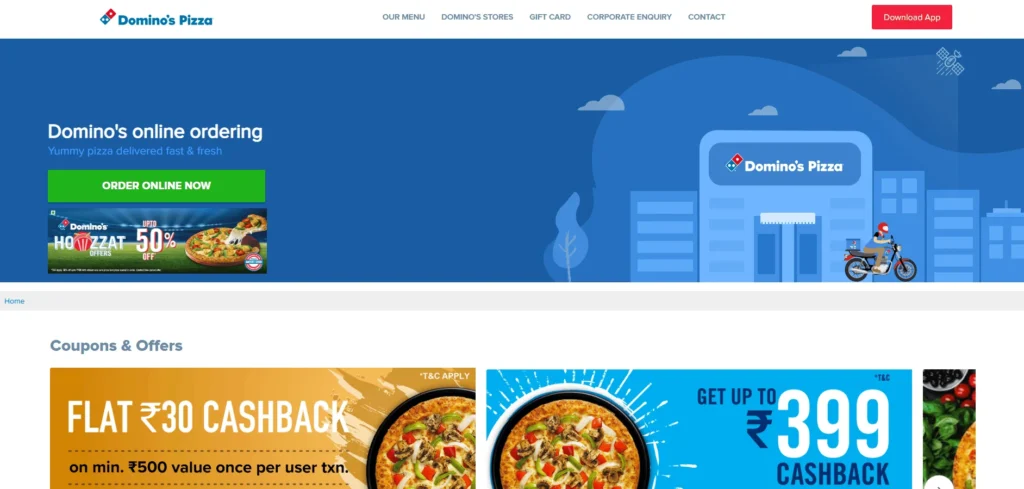
Apart from this new addition, Domino’s pioneered voice search in customer service by creating the first voice ordering system for Google Home and Amazon Echo with voice-activated ordering. It made ordering via voice searches such as ‘order a pizza’ and ‘track my pizza order’ easier. This majorly increased their online voice results for orders and very positively impacted overall sales and mobile orders.
Best Features
Allrecipes applied voice search. It helped them to promote enhanced content. They introduced step-by-step recipe videos. These videos, used by Allrecipes languages, come with voice search queries. These are easy to understand. Users can ask their queries and get step-by-step instructions. This helped them expand their audience and helped users get recipes through Google Voice Search.
Best Features
Nestlé created the “Ask Purina” Google Assistant app to enhance its content for voice search under the Purina brand. This software gives thorough information about numerous dog breeds, directly answering user queries like “What are the characteristics of a Golden Retriever?” This helped them to emerge as a renowned brand. They also have got exposure in voice search online results.
Best Features
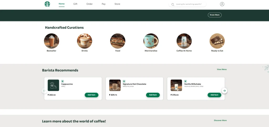
Starbucks created an Alexa skill for voice ordering so customers can order their drinks and snacks through voice commands. This is a highlight in customer experience. The ordering process is really convenient. They used their content for Google voice recognition and optimization. They also used similar platforms. It helped them to reach a wider audience and offered them a smoother ordering.
Best Features
And it has turned out to be such an excellent thing for businesses to rework their internal architectures by incorporating web design modules for emerging technologies.
These are examples of design elements that may be made easier by AI:
Image generation: This is mainly using AI for creating and modifying images for web design projects. Use tools like DALL-E to create images based on a text description or augment your photo library using AI.
Website coding: And of course, with the help of AI tools, you can also code and design fully functional websites or pages. So if you have little web design skills, these would probably help you achieve that pro look without having to go through all that work yourself.
Logo creation: AI can create for you a slick logo design to represent your website. Your logo represents your identity across the whole website and even outside it.
There are a plethora of tools and ways to integrate AI into the workflow. Obviously, find AI tools according to almost any requirement; therefore, include them in your design toolkit as you keep updating your website.
Be careful. However, you will have to edit and monitor your designs as you use AI in web development. Even if the famous tools can assist in streamlining the design processes, they should still look appropriate for your business.
Case studies of AI implementation in web development
It has engineered sophisticated machine learning algorithms analyzing user behavioral histories and interactions for Netflix. It trains the system to know what the user would want in terms of interests and preferences. The algorithms correlate genres, keywords, actors, ratings, and other similar attributes to discover patterns and suggest titles.
Best Features
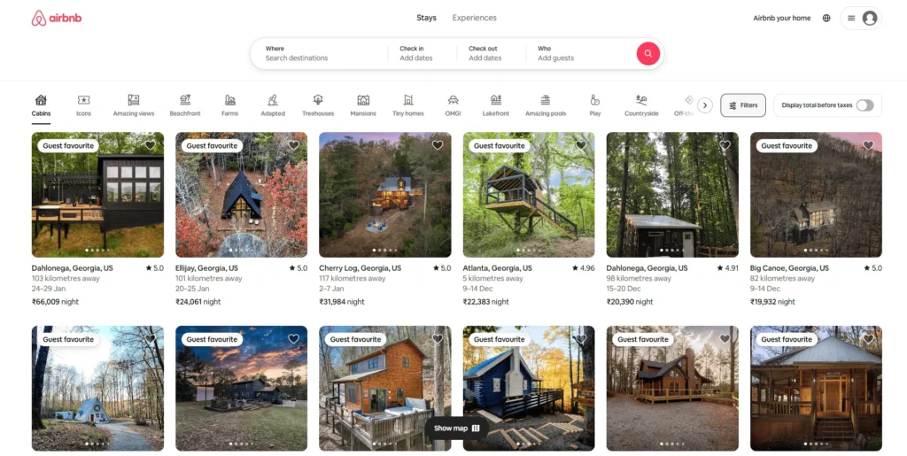
To boost search relevance, Airbnb requires automatic tagging and categorization of the more than 4 million listing photos available on its platform. Manual tagging is impractical and inefficient.
Deep learning neural networks were deployed by Airbnb to enable the automatic recognition of objects and scenes in photos. The ingenious algorithms could extract visual features such as furniture, amenities, and localized information from images, which are then matched against expected tags and categories through complementary tasks.
Best Features
To tackle people’s worries regarding accurate fit and sizing, the online fashion retailer Asos wanted to simulate the in-store changing room experience.
Asos came up with a virtual try-on that works with computer vision AI that takes a customer’s photo and combines it with that of a product image, such that the customer would see how clothes will fit his body shape before he purchases them.
Best Features
Real estate sites like Zillow had to be extremely accurate in the estimation of home value in order to gain the instant trust and credibility of homeowners.
This included machine learning from 150+ data points on a home- such as size, location, neighborhood demographics, etc. – with models being built to understand the often “fuzzy” real estate characteristics of complex signals that will be transformed into price predictions.
Best features
Get your eCommerce Website Design in few hours!
It can influence the outlook of your visitors concerning your entire website: the established color palette that can be part of the identity of the business. The client will use the colors on your website as a cue for identifying the brand. Very important in business as they must remain fresh to stay relevant.
One of the major trends to see in web design in the year 2025 is the use of bright colors, as part of ecommerce website design templates.
Bright colors attract their attention. They are inspired to connect emotionally to the page. Perhaps it is high time to re-evaluate your old color palette if it happens to look or feel outdated. You can spice it up with brighter forms of your color palette so as to make your site stand out.

Color experimentations at the website can include some perfectly ‘house’ areas of your website, which can have these branded colors. Images. Icons. Seasonal branding. More! Make a statement with your color without throwing off your audience.
Meanwhile, do anything from small splashes of color to:
Case studies of using bold colors as part of the best ecommerce website design
The company’s gaming machines for gaming computer hardware are boldly and strongly at home with a black-and-red color scheme. In contrasting these two colors, the layout becomes visually very eye-catching, and readable, and enhances user experience.
Best Features
Developers used bold colors to develop this website. The cheerful flavor of the drink and the Cartoony white glove is meant to evoke optimism.
Best Features
Reload Web Design features a cursor effect with one of the gradients, giving in an artistic feel as you browse the website.
Best Features
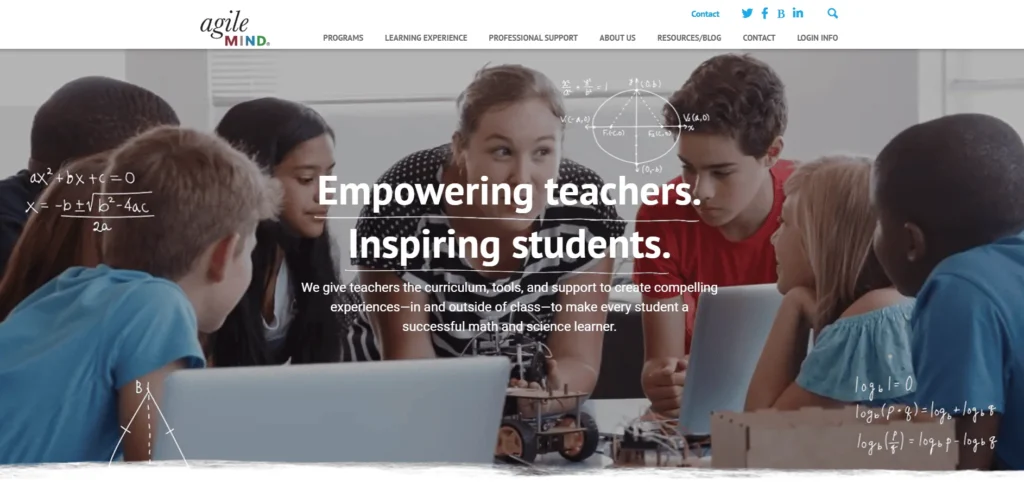
The website is designed by RainCastle Communications, Inc. AgileMind Website Design: Content is presented on a checked notebook “terrain,” one of the usual tools for learning in schools all over the country.
Best Features
Typography is central to how an audience experiences a site. The fonts must, at the very least, be eligible for the audience to have access to reading your text.
Using the right font inspires trust in your audience, and they can grasp what your text intends to say.
And while you’re going through your site, see if you can make the font selection even better for your audience. It is an excellent way to use typefaces to communicate very heavy messages with so few words, just like in the example of IGN and Microsoft, “The Next Rembrandt.”
Having an excellent home page for any website is crucial. The bold typeface is a great way to draw visitors to your website right away.
However, make sure the message is as powerful as the typography. Your content should pique their curiosity, but your typography should grab their attention.
Case studies in the use of typography in web development
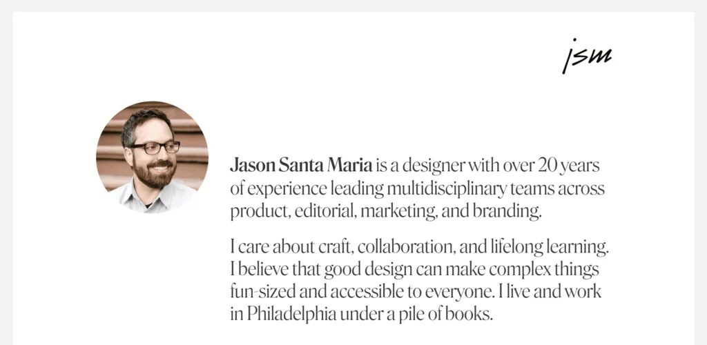
The simple style of Jason Santa Maria’s personal website is greatly influenced by the choice and styling of the typeface. The size of the article headings immediately grabs your attention. sIFR is utilized in a number of locations (like the footer headings) to permit the use of non-web-safe fonts for text instead of images.
Best Features
Elysium Burns uses large, bold typography to attract users. CSS imagines image backgrounds for the titles of articles and headings of the website.
Best Features
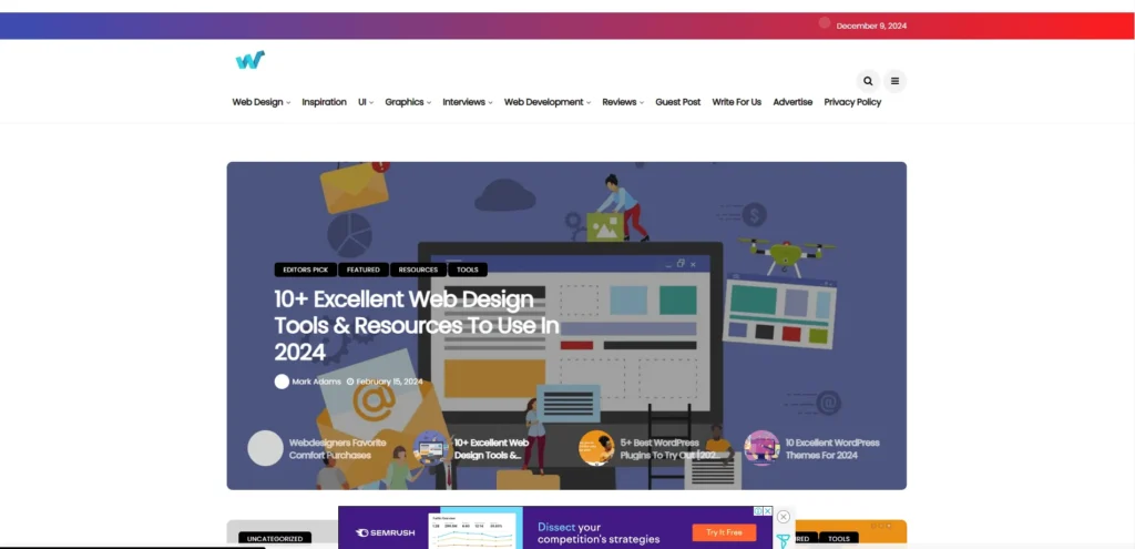
Its design upholds the recent comments of readers in Web Design Ledger using very large emphasized types as functional design elements, but at the same time, for creative effects.
Best Features
A different bold and flamboyant text query is repeated in multiple sections on the Future of Web Apps site. The website uses bold fonts. It also has negative letter spacing with a short line height. Thus, it ensures a compact, yet unique text-based navigation menu.
Best Features
Connect with us for the best eCommerce Website Design
It is in the belief of most organizations that the superior is given to more, whereas the fact lies that lesser is more. A minimalist design can become the best way to present the business in front of the audience. Thus, narrowing down the information for the audience is essential.
Diving into details and going way in-depth with your content, however, can ultimately result in giving the audience a paddling experience. Keep things simple: design and information alike. Rather, make clear all pieces of information and space them out for a less crowded-looking site.
You will have a cleaner website that will give your audience a good experience when it comes time to engage with the content.
Minimalism is design, especially in web design, something that you can touch in terms of color schemes, fonts, image placements, and even text. If you want to make your site minimalist, you can:
Case studies of minimalistic web designs
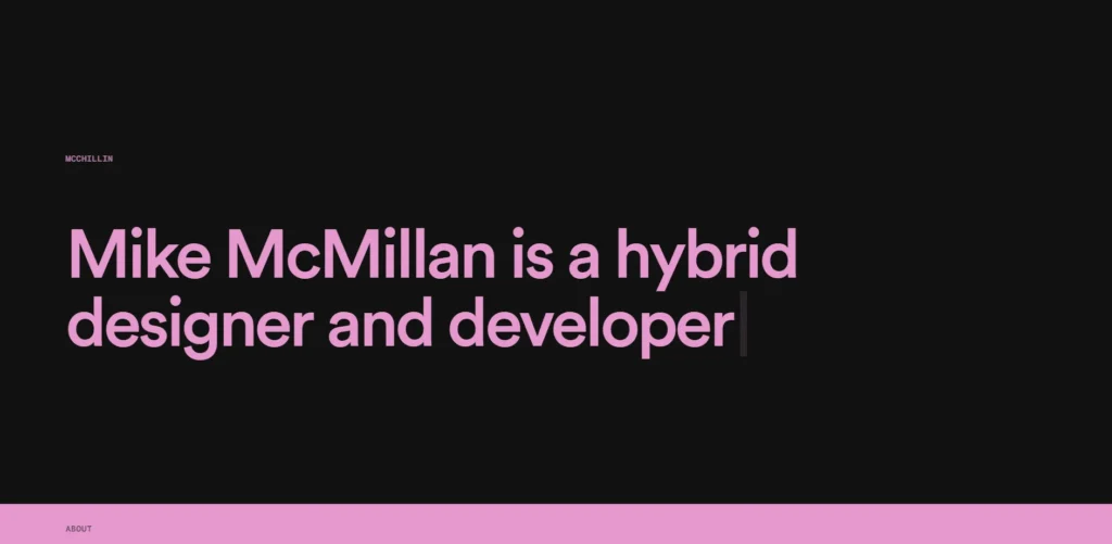
Mike McMillan makes his portfolio accessible through a design that has that fresh feeling. A nice strong background and moving text teach the visitor so much about the site owner himself, service offerings, and previous achievements.
The large link text makes it easy on the eyes, as the projects are accessed directly. The page also has enough white space, ensuring that the content is easy enough to read.
Best Features
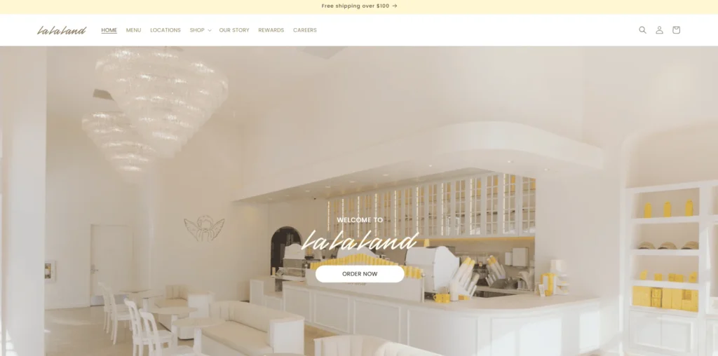
The La La Land Kind Cafe has the best monochrome color palette. It uses high-quality images that suit the overall color schemes of the site.
Except that, it is easy to read the page with much space provided. The ingenious use of typography provided by the site catches you to read the most crucial part of the page content.
Best Features
Zero is the pinnacle of minimalism and simplicity. The company’s services are introduced through a screen-sized animation, which is followed by a motto and a list of previous projects finished. You can click the links to get access to all projects.
Best Features
Mogutable is another great example of minimalist web design. Its website merely uses a grid that highlights photographs to showcase its products.
The website’s choice of light colors goes well with its home appeal. It gives off an air of luxury. Customers can use the straightforward icons to access their accounts and carts.
There is adequate white space on Mogutable’s straightforward website design. Every product page features the high-quality photos required to showcase their offerings.
Best Features
The multimedia elements and videos contribute to two essential metrics for the Google rankings – shortening users’ time on your page and helping you gain more links. When you add videos to your pages, you are likely to increase both metrics while making sure that you do not miss out on the SERPs.
Videos are also a good technique for keeping visitors on the page. So you should insert a video if there is one that can illustrate a service product, or point you’re making. If not, focus on collecting more videos for your site.

Case studies in video usage in web development
Spexster is an initiative that filmmaker entrepreneurs set up to connect videographers with advertisers. This website is the marketplace where videographers can sell their specific videos. This is the first platform that provides instantaneous ads free of charge and is completely open to all users.
Here, advertisers can search for available videos that can be utilized for their marketing efforts and send the necessary branding materials to the specific videographer for minor requests such as editing to finalize the product.
Best Features
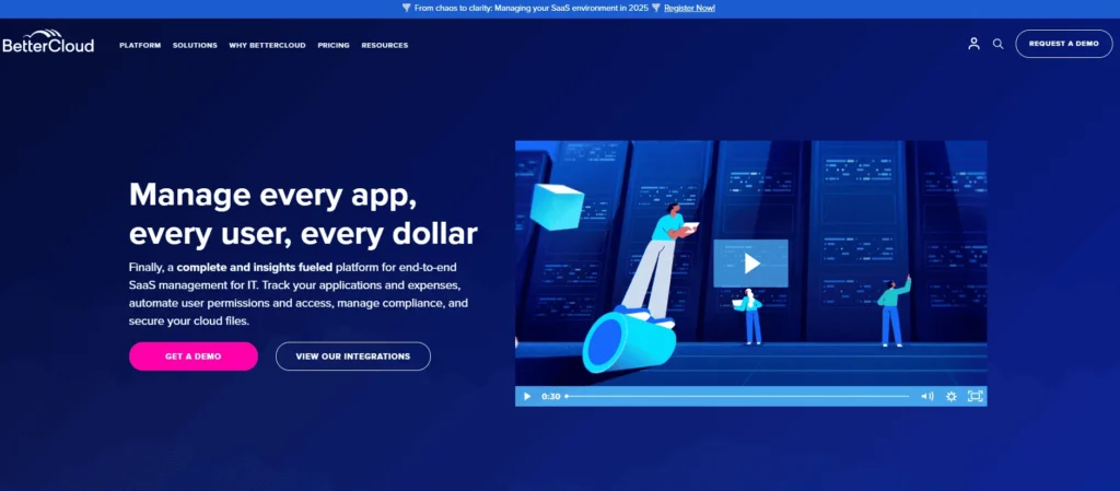
BetterCloud is one such company that provides solutions to IT departments for transforming their workforce experience and managing data security. Usage of its products will facilitate an efficient operating process. It boasts the title of leading SaaS Operations provider. Huemor was approached to amalgamate the old website with the corporate image while acting for the benefit of their own navigation management so that they are shoulder to shoulder with the competitors.
Bespoke pages have been created for each product such that they highlight both the product features as well as the problems that the prospective customers are likely to face. The page is modular and should be easy to reconfigure to create new landing pages for products coming in the future.
Best Features
The OBIE uplifts software standards and industry code. Their aim is to promote competition, innovation, and transparency in retail banking across the United Kingdom. Such a report from the CMA observed that newer banks tend to find it difficult to penetrate and grow into the market.
Open banking has since enabled customers and small businesses to share their account information with third parties safely and securely after launching it in 2018. This has enabled such providers to use that data to tailor apps and services around people’s individual financial situations.
Best Features
Aspirity Tech has a wide range of IT services for individuals and businesses such as consulting, software development, and quality assurance. Their web development project included a logo and web design development.
The company wanted a very strong, elegant appeal to the web portal. The entire site has been totally rebuilt from scratch, thus making it easier for someone to navigate than before.
Best Features
Get custom website design in few hours!
Little, unexpected things that happen to consumers when they visit your website are called micro interactions. A micro interaction occurs when a user performs an activity on your website and a certain reaction occurs.
Microinteractions encourage curiosity and keep your audience interested. By clicking on the CTAs, users can get notifications on your website.
You can bring your micro interactions alive on-site with cool stuff like scroll animations, chimes, and much more. It would be perfect to trigger micro interactions on pretty much any action that feels like it needs to have a bit more importance assigned, such as when clicking an active contact button.
These will provide a more engaging, interactive overall experience and improve your site design in 2025, in specific ways, as well.
Case studies of the usage of Micro orientation in web designing
The smooth slider navigation technique is complemented by the bullets’ animation style. The spherical background smoothly changes to the next slide or hovers above a bullet, changing into the bullet next to it.
Best Features
Alban Mezino, the creative front-end developer, has a pretty bare, minimalist website. Typography is everything here, though. You can experience exciting emojis and stickers here.
The site also did an excellent job in typography. The fact that some words are in boldface and others in red only serves to give emphasis to what should be highlighted points. At the top of the page, we are shown a set of large, rotating keywords describing the author and his projects.
Best Features
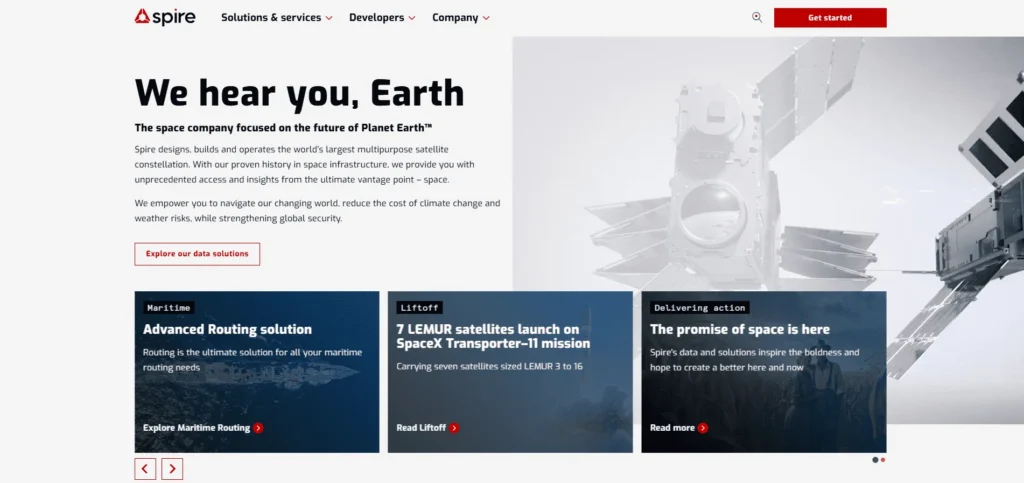
Spire Global is a satellite analytics company for aviation, weather, and maritime tracking. The website is the creation of a very successful creative agency called Locomotive, popularly recognized for providing engaging solutions regarding micro-interactions.
Best Features
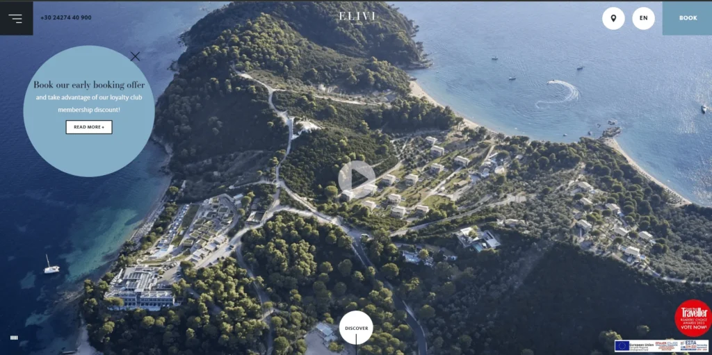
A mouse pointer is an excellent pointer to indicate what can be clicked on the website. What is greater is that it can provide the action that is going to happen once a button or link is clicked. We also ended up with several websites that use cursors creatively for this purpose. But this one is a really exciting online presentation for the luxury Elivi hotel in Skiathos.
This is an interactive cursor, and it begins its life as a simple circle; as it hovers over various elements, it assumes other identities. This means you can see just what lies beneath the surface of the site’s interactive elements and what one can click. For example, we have the simple, textual button, and as soon as the pointer hovers over it, the sphere turns into a line. Hovering over a variety of other links produces the same effect.
Best Features
Your audience is at the center of your business. For a successful online experience, it is essential to provide a positive UX so that your audience remains on your site and learns about your business.
Think about what your target audience would want to see on your site, or what elements would improve their experience. Whether it’s the navigation, typography, media, the best ecommerce website design, or information on your site, you always want to consider how your audience will respond.
The difference between gaining and losing leads is a well-designed user experience. If the user experience isn’t optimized, it doesn’t matter if your website is visually appealing and effectively conveys your brand. To keep your audience interested, make sure your user experience is tailored for the upcoming year.
Depending on your target audience, UX may vary slightly, but there are certain techniques to improve user experience on your website. Among the things to think about are:
Case studies of UX designs in web development
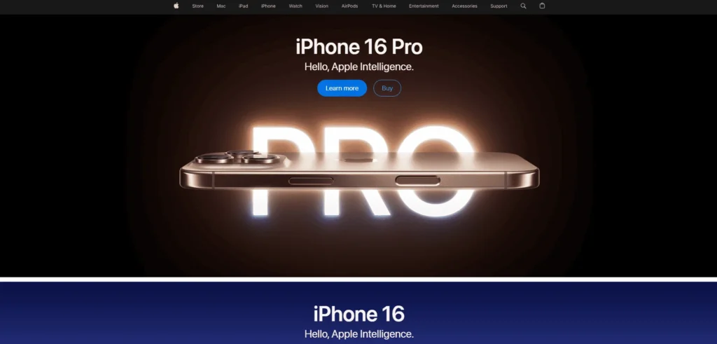
Apple’s sites embrace a minimalist type of design along with interaction-loaded visuals.
That is all because of the following design characteristics:
One can compare the different colors of an iPhone 15 by sliding on the webpage for the product or zooming in on cameras by clicking a button.
Best Features
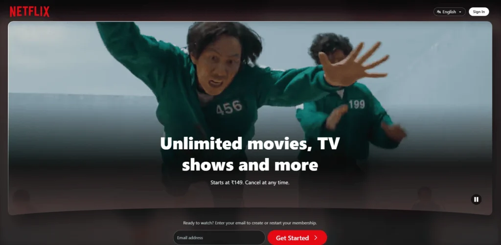
You can peruse thousands of films and TV shows on Netflix without getting overloaded. It provides you with a customized experience. The interface of Netflix’s website is clear and simple to use. Based on user activity, the Netflix algorithm makes tailored recommendations. Netflix keeps things interesting by showcasing new content first. All of the buttons are practical and easy to operate. For instance, “New Releases” is shown at the top of the Netflix homepage.
Best Features
Zappos is one of the best examples of UX design in eCommerce. They have an easy shopping experience with breadcrumb navigation, sophisticated filtering that makes shopping easier: high-quality product images from different angles, personalized recommendations like matching outfits and similar stuff, a page enlargement for ease of use, every Zappos page has a search bar. And a very clear interface through which customers can easily find what they need.
Best Features
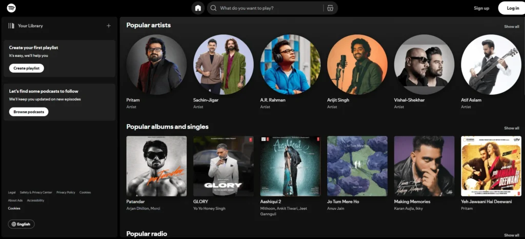
It’s kind of like Netflix but for music. Users can browse around for materials, build their playlists, and explore tens of thousands of songs and podcasts. It has large buttons, clear labels, and excellent levels of color contrast among several other accessibility features on its pages.
It also has a nice visual hierarchy that helps users move through playlists, find new music, and do other things, like embed playlists, all aimed at making the site as user-friendly as possible. Bold fonts and bright colors complete the visual storytelling of the brand itself.
Custom recommendations are provided by the platform according to your location, browsing history, and preferences. Such features provide an excellent user journey by allowing very personalized experiences.
Best features
Get best consultation for your Website Design!
With smart content loading, your website will load only what the user sees and will not waste any valuable resources on content that may never be viewed, thereby preventing any server overloads and helping set the time for an appropriate site loading speed.
Smart content loading is one of the best trends in website design and development. We have known infinite scrolling and lazy load for ages through social platforms like Meta (Facebook), Instagram, and X-with a reason, of course.
Based on the host of your website, you will be either using the backend editor to insert custom scrolling or going for such a plugin. Some other options, for example, WordPress, would require you to use their app-defined facilities for smart content loading.
In case you are having difficulties adding this feature, contact the developers and designers at Intileo Technologies to do that for you!
Case studies in smart content loading for websites
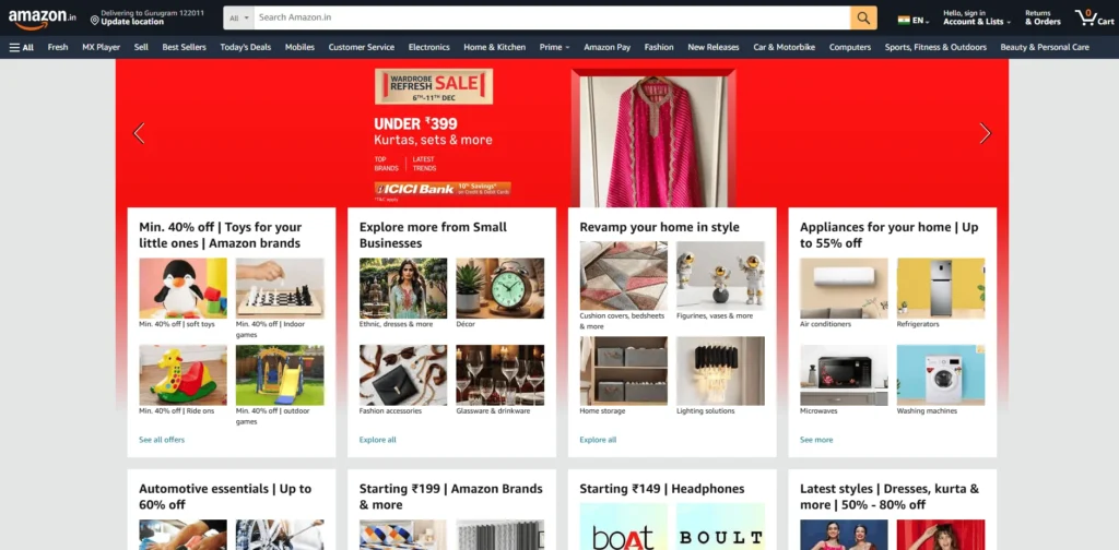
A site that showcases smart content is Amazon. The Amazon recommendation engine comes up with products and services based on the user’s purchasing history.
Key features
They give water resources to very needy persons, mostly writing about people who can open a tap and obtain water. By telling stories about those who do not share that luxury, they can reach the centers of the best help audience.
Key features
ThredUP is a second-hand clothing line, but their blog is full of resources about sustainable living, clothing trends, and more. They do see a larger picture of the content. Indeed, they have positioned themselves as an expert reference for news.
Such a thing can happen with any brand. What do your consumers care about? Set up Google alerts and build blogs and posts that would respond to the latest news in your field. Get into the action and create articles exploring and expounding trends in the best ecommerce website design to solidify your place as the expert brand.
Key features
Bringing in external voices when creating content is not something to feel bad about. It extends your reach to more audiences and translates your issues more intimately. Experts in the subject matter could also bring great credit to your brand, which means much to your SEO.
By the acronym known as EAT Google uses it to qualify and rank humans under quality standards. EAT refers to edification, authority, and trustworthiness. One way of bringing these aspects into your content would be by calling upon subject matter experts.
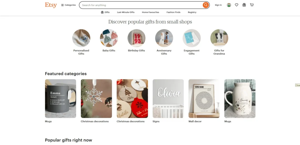
For example, one could perhaps visit the blog at Etsy: here is where some of their always-in-the-house industry leaders and change makers appear.
Key features
Up next as one of the latest web design trends is minimal icons. This simply stretches the overall minimal designs to icons.
Minimalist icons really rely on the elements essential to convey the function of the icon to the viewer-clean lines and shapes that are simple and minimal colors that can give a very clean and timeless look to any part of your site.

The most ideal is judging your existing icons and redesigning each in a new, unified style for minimalist designs. Study your site’s iconography while analyzing these questions:
When you have looked through your present icons, you will know what kind of design you intend to pursue, and whether or not you would like to go with a more minimalist one.
Case studies in the best implementation of website icons
They’ve got lots of fantastic features and add-on applications, which not only make my life as an artist a whole lot easier but also help the coders integrate them into their structures as well.
This search function is quite simple yet helpful, while the layout of everything is extremely easy and simple to use overall. And best of all, they have many top designers contributing to the site as well, so the quality at The Noun project is very top-notch.
Key features
Flat icon is another go to icon website. While it doesn’t compete with the design standards of The Noun project, it is still above all competitors. And, it is good quality just like Noun Project, with the added advantage that the style of icons here varies from all their other competitors.
Again, you will enjoy the search function; it’s usually the first thing you do when you come here for you usually know exactly what you might be looking for. It probably sounds funny, but you do actually find the ads helpful here. They have links to other websites like Freepik and Shutterstock.
Key features
This is a very quick search for Iconography, and there are so many excellent works from worldwide sources. Even so, they really cannot be considered free icons, but rather that give a pretty good sense of what you want to do or what kind of style you should adopt while looking for free icons. You couldn’t really live without this tool!
Key features
Connect with best Website Designers!
You might think about the 90s when you think of bold 3D design. Well, however, like a lot of things from earlier times, 3D design will come back to haunt you in 2025.
3D elements are a great way to get the attention of users by directing them to an important area in your website. For instance, an excellent way to make your CTA buttons really stand out is by incorporating some sort of 3D graphic or animation into them.
The following regions are suitable for the addition of 3D elements:

Case studies in 3D graphic designs in web development
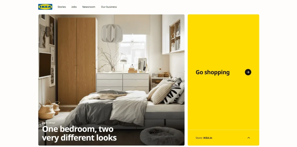
Users may digitally arrange furniture and décor in their houses with the help of the augmented reality app IKEA Place. The software gives customers a realistic and interactive sneak peek at how IKEA products would seem in their environment by utilizing 3D images and animations. This immersive experience streamlines the furniture buying process and assists customers in making well-informed purchases.
Key features
Google Earth gives viewers a realistic and interactive representation of the Earth through the use of 3D images and animations. Users are able to navigate around 3D and visit various areas.
Key features
This very clearly sums up some of Apple’s most popular goods. It gives life to them straight on the landing page of the site. The page itself is quite simple; it doesn’t use jazzy animations or any films. The product images are static, but the 3D design gives them depth and accurately depicts how they appear in real life.
Key features
Chirpley is an AI-enabled marketplace that builds bridges for brands and micro-influencers who are looking for highly unconventional ways to market their products. The eclectic design of this company site is further set apart from convention with the use of three-dimensional cartoon images.
A bright red feathered creature is seen across the whole site. This eclectic mascot is placed front and center on the brand and is viewed within the quirky surroundings with their more technical exposition that describes how this unique product works.
Key features
The growing emphasis on organic and sustainable design comes next on our list of design trends. Businesses are integrating those elements into their designs as customer attitudes generally change in favor of a more sustainable future.
It can also be more individualized, such as when you use colors and images of nature in you’re branding to generate a certain feeling.
You may incorporate sustainable themes into your website in a variety of ways. First of all, make sure to mention in your content whether you provide any environmentally friendly packaging, services, or goods.
Additionally, you can:
Case studies in Organic and sustainable themes in web development
An excellent illustration of a website with a sustainable design is Man Overboard.
First of all, the user may easily navigate the website and quickly comprehend what needs to be done. Furthermore, the loading speed is extremely efficient, demonstrating that they are utilizing the least amount of energy and resources feasible.
Additionally, they are sincere and truthful about the goals they have for their work. Since Manoverboard is a Certified B Corp with a focus on environmentally responsible web design, it only makes sense for them to highlight their strengths and uphold their core principles.
Best Features
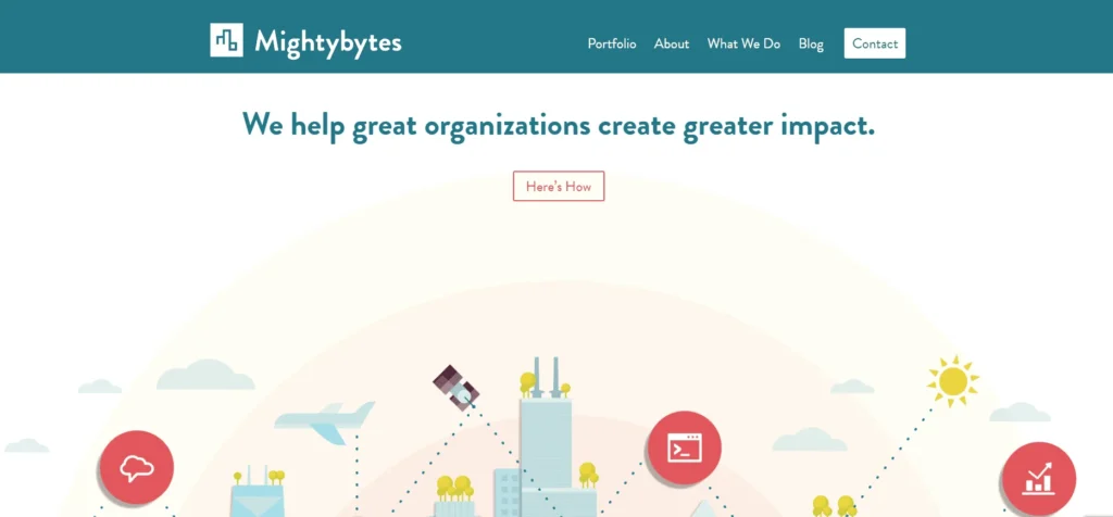
Their website is attractive and easy to use, plus they are a recognized B Corp and digital agency. Users are immediately aware of the services the company provides. Additionally, they incorporate sustainable practices throughout their offerings.
Additionally, Mightybytes is completely truthful and genuine; it doesn’t take advantage of people or deceive customers. With 1% For the Planet, Mightybytes donates one percent of its earnings to the environment. It enhances their website using Ecograder, a free web application. By lowering power use, this instrument limits energy use and gets rid of waste.
Best Features
The website is one of the best examples of sustainable websites.
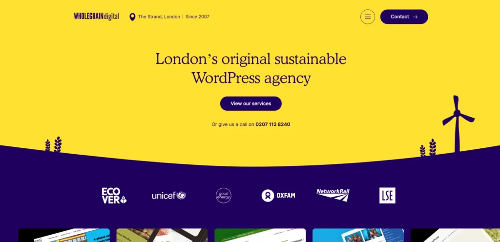
The Wholegrain Digital website is indeed fully aligned with the notions of sustainable web design. The messaging is crystal clear and does not mislead any consumer. Truly, the website is efficient in its speed and resource usage.
Best Features
Fairtrade is another website that has embraced sustainable design ideas.
Making sure their website is clean and powered by sustainable energy is one of the important requirements they fulfill. The Fairtrade website is powered by green energy.They have got the recognitions from the non-profit Green Web Foundation.
Additionally, their website is user-friendly and has a wealth of useful information in a variety of sections. Additionally, the website loads quickly, indicating that they use fewer resources. There is no deceptive information or greenwashing techniques, and their work is detailed in great detail.
Best Features
Hire the best eCommerce Website Designers!
Vintage is popular for everything from web design trends to apparel. Old-school writing and grainy overlays are two examples of how antique web design is returning for brands across several industries. Your business can update its website for 2025 by implementing this web design trend.
You can use a variety of techniques to give your design a retro feel.
First, consider why you wish to evoke sentimentality in your customers. Do you want your brand to seem classic? Or are you trying to increase sales by reviving a sense of nostalgia? This stage will assist you in determining what modifications to make to your website’s design.
Next, you can experiment with the following design components to give your audience an antique appearance:
Examples of cases where vintage looks have been added to a website
To start our list, this website talks about the history of an American baseball team, the St. Louis Browns, from the first part of the last century. It takes you from formation through history to the point where the team relocated to Baltimore, Maryland. This website has complete usage of the page and blends seamless scrolling effects through each story segment. The textures, antique fonts, and archival images give such a distinctly vintage feel. It is a fitting tribute to the great squad.
Best Features
Are you interested in collecting historic coins that haven’t been restored? It’s true that everything has a website. The color design and page decorations on the old box website have a nostalgic vibe. It is, of course, very simple and definitely limited but the information contained within is adequate for revealing the finding of lost treasure.
Best Features
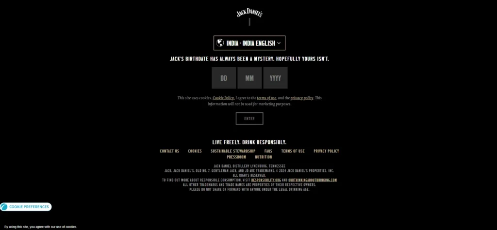
A vintage page with a dash of whiskey is one of the best sources. Although it does not occupy the last position on the list, Jack Daniel’s is a proud whiskey icon. The users get introduced to the Jack Daniels story along with the brand and the merchandise using immersive storytelling. The union of modern and vintage elements creates an experience enticing the user to explore and perhaps even come away with a drink.
Best Features
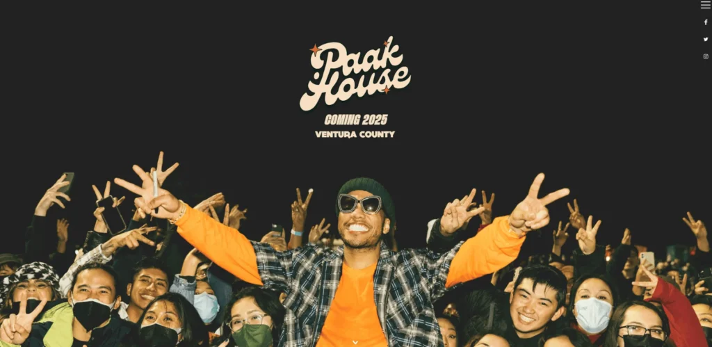
Established by Anderson Paak’s Brandon Anderson Foundation for grant-making in favor of art projects and access to arts and arts education. The homepage of this website features really gorgeous artwork with bright colors reminiscent of an epoch gone by, backed up by a parallax effect that becomes noticeable as you scroll down. It then follows social media links, a little video, and some options for donating to the cause. Overall, this is a wonderful example of how a one-page site has power.
Best Features
New techniques for testing and fine-tuning designs have recently emerged among SEO specialists and site designers. It takes time to discover and learn the nuances that your users want; web design is not a black-and-white procedure.
By 2025, web designers will use data to drive their design. Your data can bring out creative ways of developing websites, whether it’s time or even emotion, formulating the website, especially to the user’s needs.
There are different ways of collecting data to make your website attractive and also increase conversions. Probably the most used way of knowing which designs suit a preferred audience is through A/B testing. Regularly generating and submitting tests helps understand maximally efficient design for use on your site.
Case studies in data-driven designs in web development
Amazon is considered one of the best examples of a purely online data-driven application using the best ecommerce website design templates. It uses data from previous searches and the preferences of customers to provide accurate suggestions. The forecast is made about what and when their potential clients would buy. After that, the expected products are sent to warehouses as per the location of customers. Therefore, whenever an order is placed by a user, these can be sent off at once.
Best Features
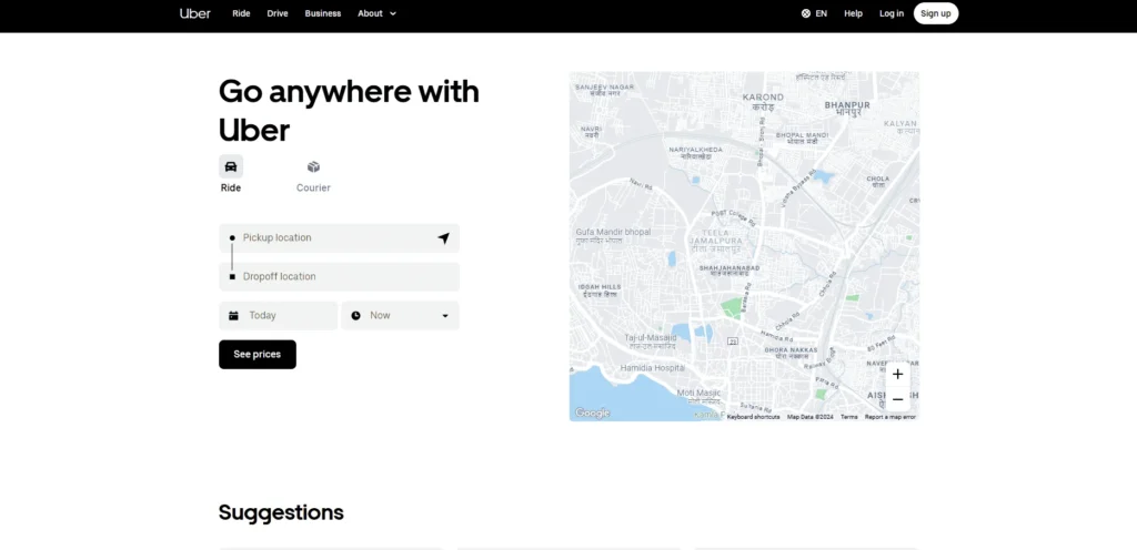
Uber has to be one of the biggest ride-share companies in the world, and it uses data-backed information to arrive at very accurate and informed decisions, if not per se, on a much larger scale. It enables users to get the trustworthy and effective transportation that they require.
For example, machine learning is one of its areas, wherein it helps provide a surge multiplier for a particular trip. Other aspects considered while calculating a surge trip are weather, events, traffic, regions, demand, supply, and many more.
Best Features
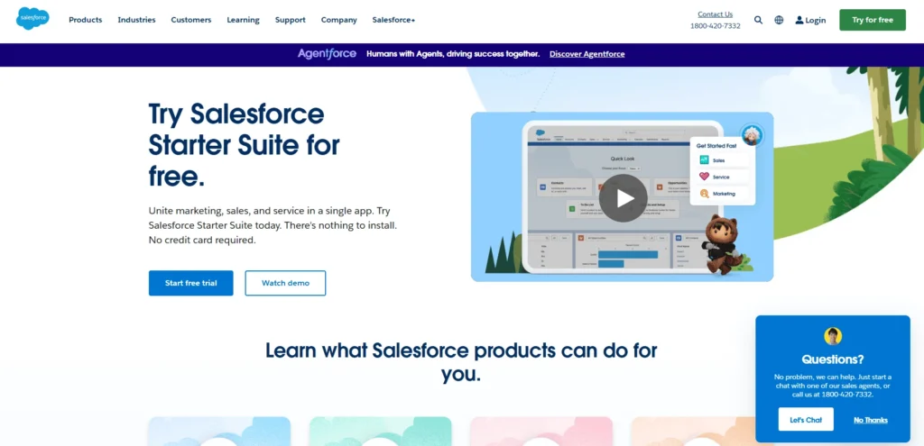
Deep down within the sales department, Salesforce works as the second brain of the organization. Everything about the potential customer is known from the previous opportunities to the critical contacts and even wishlist items because everything is recorded by data. Using this data-driven web application, the customers of your client can get valuable information regarding their original contacts. Thus, the Customers of Salesforce will be able to see more sharply, analyze data better, and make sound decisions.
Salesforce is known to incorporate UX design considerations carefully, which is important for SaaS apps to realize their full potential. Good UX design enhances retention and satisfaction, and it ensures a seamless experience and quick access to vital information, thus enabling users to make better choices. The approach shows the re-engineering of productivity through user experience and software.
Best Features
The massive streaming service Netflix positions itself as a data-driven business. The business automatically gathers several types of information from its customers. This frequently consists of:
Search terms
This provides marketers with useful information about how to increase conversion rates and what kind of content to provide. As a result of Netflix showing them exactly what they want to see, they have a better viewing experience.
Best features
Get the #1 Website Design & Development services!
Not staying on top of the latest trends in ecommerce website designs as may mean losing opportunities for improving the user experience and increasing sales, and it may result in potential clients being missed because they may prefer newer features and styles that offer a more convenient online shopping experience. Design trends will always change from time to time; therefore, keeping abreast with the most recent trends is important for keeping your site fresh and attractive to users.
We are going to list the top 13 trends of 2023-2024, still trending. These trends are common in any web development and design application for an eCommerce business.
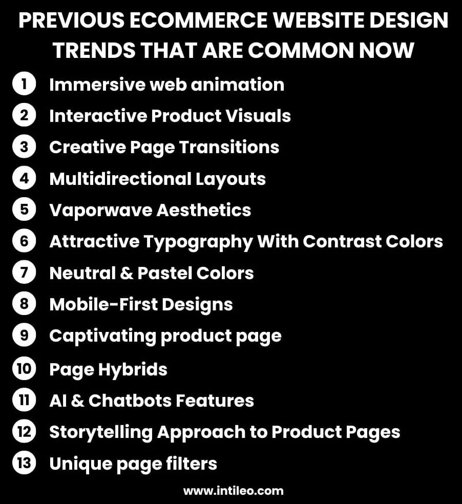
The year 2023 will see the emergence of immersive web animation in eCommerce websites than in previous years. It is one of the many devices that web designers at the moment employ to give that elusive “decorative” appeal that will make it feel like the shopping scene itself- capture details of the products, deconstruct objects, and make other wonderful transitions.
An example of which they regard as a nice case to be paired with their creativity in web animation is the one in Vibor. It created a beautiful form of animated reading that engages with this hush-hush hover effect. Apart from that, it has raised its products, sensors in the automotive industries, into the hero setup that brought those animations to bear on them. To afford this principal thing, flare and display must not be abused.
So, it makes it very easy for the customer to find what he needs and check out in no time. Impulse buying works best in such a design because when viewing the intermediate images and descriptions of the product, the consumer is always tempted into making that purchase decision. Immersive web design is significant in ensuring a good user experience which will create customer satisfaction and, consequently, retention.
The rising shift of rather high expectations by customers in eCommerce has proven to enhance the impact of such businesses on brand experience! Customers get more attached to brands that truly go above and beyond to add entertainment value to their experience as these associations create certain life-long happy memories.
Customers expect to better interact with a product before they go through the actual selection. The product animation highlights an important feature or details of the product for an end-user. Some ideas that will add creativity and would be unique to one’s product page include 360º views of products, 3D animations, augmented reality, and hover animation.
Page transitions are animated transitions. They are clever page transitions whereby some elements are included to make the user experience more interesting. Usually, they animate elements as the page loads, emphasizing the actual page change or transition.
You can actually make a page interactive, creating a more fun and unforgettable experience. Although absolutely optional, it is wonderful for improving the user experience. Used correctly, it vivifies the site and makes it purposive.
For instance, Zero-the branding studio in New York, where blurs photos through creative page transitions and a side navigation menu. It will definitely be noticed by online customers who would appreciate it. This makes them spend more time on your website.
Well, because it makes it easier for companies to make their products visually appear more action-oriented and user-friendly, the multi-directional layout is expected to be quite an exciting trait of eCommerce UIs in 2024.
Besides having the possibility of comparing products next to each other, this form of layout also allows the customers to have better buying judgments. Movement today has become greater than simply up and down; now there is diagonal movement left, right, and in between.
This kind of intellectual relationship makes any design wonderfully inviting, as it must speak the mobile-first design and involves selling experience, making it apt with what’s happening in e-commerciality today. This can help companies drive their conversion rates upward by offering a more engaging and immersive purchasing experience to consumers.
Vaporwave Aesthetic Design: Inspirations, apparently, come from the cyberpunk subculture. It’s a design aesthetic grounded in distinct futuristic, often dystopian visuals that evoke images and incorporate high-tech elements along with glitchy touches and some bright colors.
Specific components derived from the 1980s and 1990s-such as gradient color blending, neon pastel color palettes, and psychedelic fonts-vaporwave are a fresh pop culture phenomenon that is rapidly capturing the modern internet.
Of a well-structured web design, color and typeface are the two most significant components of it all. An eCommerce website with vibrant and piquant typography with contrasting colors draws your attention to content bold yet easy-to-read fonts Available. For example, the website can have black writing on light background color or in bold sans-serif letterforms cast in white on a dark background.
Spacing would be required between lines and letters so that it is comfortable to read: proper space allows for good reading. When applying different font weights and sizes, such a point could be established for the major information in the hierarchy of information. Complementing the general scheme of the website, the palette should be chosen with attention also to keeping a uniform look.
Hire us for designing your dream Website!
Soft and neutral shades on a website generate an ambiance that is soothing and inviting to customers. It enables the customers to concentrate more on the products and services being offered without having the distractions of bright colors. It has a very professional and organized look and feel that should help with the customer’s trusting the site.
The colors of the homepage are part of the overall narrative of how the L/L Supply brand is told by extending its white background and earthy neutral tones to the product pages and beyond.
Applying pastel tones can be difficult; if done wrongly, the website would end up looking pale and sterilized. So for you to achieve the perfect mixture of tones and colors, you might want to hire a web designer who can do the work.
Your website needs to be mobile-compatible bearing in mind the fact that about 45% of consumers around the world usually buy from their phones once a day. A mobile-first design methodology is all about making websites and applications- delivering top-notch quality user experience to consumers who use mobile devices.
Mobile first means designing for a smaller screen size, as well as considering additional constraints of a mobile device, and then modifying the design to suit larger screens. It makes it possible to develop websites and apps that optimize the experience on mobile devices, which, in turn, means faster loading time and improved performance in general. It also gives your website better search engine visibility, e.g. Google or another search engine.
Mobile-friendly websites, making, among other features, around three or four times faster than the speed of a comparable standard desktop equivalent, according to research.
Because of advanced interactive design techniques for virtual reality (VR), augmented reality (AR), and even 3D photography-they have been loved since 2021 up to the present time, and they will also be taken into consideration in 2024. This kind of technology assists consumers in understanding those products they want to purchase.
Product pages, for example, are among the most essential facets of an online store site. Attractive graphics, enticing customers to the product in its eye-catching glory, can make all the difference when it comes to sales and conversions. This includes everything ranging from product images to product descriptions to the way it is presented on a website. For keeping up with the times, check out the best Shopify product pages that hold the highest standard for effective design and functionality.
Sometimes, the most popular kinds of hybrids that you can spot online would be landing page and product page hybrids. For sure, your page contains information about a product, attractive calls to action, and product demonstration videos. Such pages would also be designed in order to give new product publicity or help increase the visibility of an already existing product. Such pages aim to build informative and persuasive visitor experiences and finally convert them into customers.
AI and chatbots have emerged as one of the most exciting design trends in eCommerce today. It was promised that they would lend themselves easily to a full-fledged customer experience for online shoppers, ranging from delivering accurate information to suggesting products and helping them find specific items. They could provide highly personalized recommendations, answer queries, or lend their ears to a customer who needs talking. Intelligent AI and chatbots can lead to a more effortless checkout process, which is faster and more secure.
When it comes to product pages, storytelling is an ideal approach to bring out all the features of a product that customers can relate to. It can further describe how this product can be used in real life and what good it can do for them.
Such colors have been suffused into the website of ‘The Sill’, such that an utterly clean, clear, and happy look is created as one visits the site. The Sill and its virtual shop have the same imagination: Plants make life happy-affinity with them is what they try to evoke through the entire website by making it look simple, energizing, and still maintaining a lovely natural vibe.
You can even tell visual graphics to tell a very compelling brand story and make a lifeless product new. Storytelling helps in making an emotional connection between consumers and brands by increasing brand credibility and gaining consumer confidence. Your audiences can be reoriented from selling into helping them out of their issues through stories. Much of the work may need to do a lot of shifting and change. With such an approach, the information can get very interesting.
This has created fun filters, a revolutionary eCommerce design application, from the traditional page filtering system by reinventing it creatively. This is a new experience for clients as it provides a very unique customer experience from the usual page filtering system. The non-traditional filters on the page include sliders, toggle switches, and so on instead of the simple drop-down menu. This approach also allows for incorporating more visual aids such as icons, illustrations, and color codes to help users quickly grasp what they want.
Get fully functional website design & development!
There is an unaffordable impact of eCommerce website designon the success of their sites: expectation and no exception are the beautiful, well-functioning sites. Why? 89% of customers switched to a competitor’s business after a poor customer experience.
Because there are thousands of companies competing for a customer, that’s not valid because you’re competing against your neighbor but against global giants. The secret to coming on top and doing well in modern-day eCommerce? A website that looks fantastic and offers an exceptional user experience.
This is a guide for people, whether new small businesses wanting to set up their first eCommerce site or entrepreneurs wanting to get their current websites’ appearance and performance better, to refer to best practices in eCommerce website design and draw inspiration from some of the best real-world examples of eCommerce sites.
Perfecting that business model? Check out some fabulous examples of online businesses and see what’s possible. Then read why Intileo Technologies, one of the top Web Development Companies is the preferred alternative to BigCommerce and Shopify. Prepare to go back to designing that killer site!
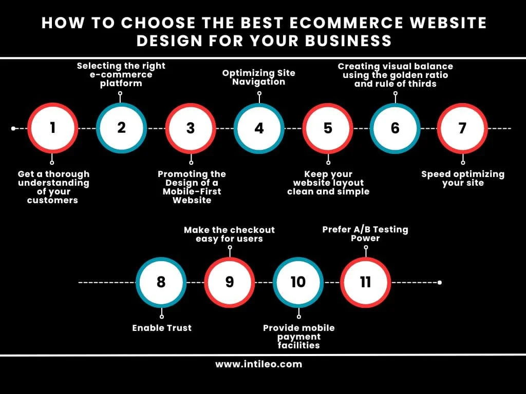
The eCommerce website is not just a digital catalog; it is also a storefront, sales representative, and brand ambassador in one. Every online store dreams of a lucrative sales figure through their website but not everyone can be everything to every person.
You will then need to understand:
Now that you have understood who your customers are, and some general ideas on how they might resonate within a website, it is about time to figure out what eCommerce platform meets your needs and goals.
Consider this decision the foundation of your digital business – the slab under which your entire online presence will rest. Surely, this is a significant decision as it affects your website’s performance, scalability, and ability to meet your business’s changing needs.
Some ecommerce platforms can only work through their own hosting facilities. In the case that you are tempted to opt for these one-stop solutions in building your eCommerce website for some other purposes, perhaps it’s best suited to your needs. But if the hosting, price, or features don’t meet your standards, you won’t move your online store elsewhere. You will need to build it from scratch again.
Most online shoppers today reach for a smartphone instead of the usual laptop or desktop. Mobile retail sales alone are expected to surpass 700 billion dollars in the United States by 2025. With statistics like these, the importance of a mobile-friendly, modern design for your eCommerce website cannot be overstated. Slow load speeds, difficult to native website, and unresponsive eCommerce website design can tarnish your brand’s image. It also affects user experience.
Google implemented mobile-first indexing, meaning the mobile version of your website is prioritized for search rankings. By this, ensure that your website has the best ecommerce website design and builds a rank in eCommerce. You can use Google’s Mobile-Friendly Test tool to check whether or not your eCommerce website is mobile optimization compliant and what issues it highlights for making any changes.
Take a stroll through the store that is finely organized and commodiously spacious, everything is on its label, and easy to find. Such a store would be so easy to navigate and would be something that most customers would take pleasure from, isn’t it? This, however, is true for your virtual store.
It is user experience (UX) that warrants any hassle-free eCommerce website. At the core of all great UX is navigation, something that is intuitive and very easy to follow. Streamlined navigation minimizes any possible effort in the search for products, information, or the completion of a purchase. If there is an easy around-the-site movement, it would be perceived by the user as trustworthy, it would allow time for the user to spend on the site, and opportunities to return have been high.
Every time we go to our email inbox, use a search term, or scroll through social media websites, we are faced with exposure to a seemingly endless array of choices and volumes of information. Since our lives furnish enough eye clutter, a clean and uncomplicated layout could face up like an oasis in a desert.
Best eCommerce sites have a stand that is quite visually balanced and de-cluttered while taking visitors through the online shopping experience seamlessly and effortlessly.
Fine-tuning your site might be too overwhelming, but there are many sources to help you out. For instance, hire one of the trusted Intileo Technologies to complete your project if you need help building or customizing your store.
A tidy site makes it easier for someone to visit a site and concentrate on the important parts of the products being sold. They can make it easy for the consumer to know what it is they are looking for, and take the rest of the spotty search process, while also making it more pleasant and easy to shop online.
Using the golden ratio and rule of thirds as one of the methods, such as when designing your eCommerce website, can create that visual balance. It’s one of the oldest golden standard design examples and it’s proven successful time and time again. It’s an ancient mathematical concept, and the rule of thirds, which has been made for photography in the first place, works equally well in web design as in the visual disciplines.
The golden ratio creates a spiral that demonstrates ideal dimensions and placements throughout a variety of rectangles (or, in the case of website design, content blocks) within a frame.
There are two inputs under the golden ratio. The rule of thirds is created using an evenly spaced grid consisting of two vertical lines and two horizontal lines that produce three rows and three columns. Each point where the line intersects indicates the best placement for subjects or content that you want to highlight in that frame. It can also direct how you visually represent your website.
An online website is a selling machine when it has a loading time from zero to two seconds; a site is very efficient in generating sales. Buyers want instant satisfaction when moving from yours to an online dealer. Slow loading of web pages results in high bounce rates and conversion loss, as once a visitor finds that the web page takes time to load, they leave the web page.
Loosen at least a few seconds in load time through well-designed improvements on the website so that the initial five seconds have the most effect on the conversion rates.
Load time is not just a good user experience; it’s also an integral aspect of search engine optimization. For most search engines such as Google and others, page load times play a big role in determining the search ranks. A slow website will be poorly visible in search results, while its speedy counterpart will attract higher ranking and increased organic traffic.
For the first time, a shopper visits your eCommerce store, and he or she is making leaps and bounds with a jump into the unknown. It is up to you to provide a security and trust accord in which the customers can purchase, visit, and be loyal to your product for the rest of their lives and tell their family and friends about it.
Creating an organized and professional design, flow, and content on your website goes a long way to building trust. But there are so many more things that you will have to do to keep your customers safe and help them feel like their purchase using your website will sufficiently keep them happy.
Imagine a potential customer who has earmarked time on your eCommerce store, adds some of your painstakingly selected products into a cart, and is going to purchase something online. They go to the Checkout page, but they find some form fields are cut off in mobile view, the field labels are too small, and entering payment details is tedious.
Finally, they managed to fill out the checkout form and press the “place order” button, only to receive an error message. You must first create an account before you can make a purchase.
Not only are the payment options a convenience for online shopping, but they are also the path through which visitors are converted into satisfied customers. Therefore, it is evident that a developing eCommerce website should inevitably require all forms of payment, which has become necessary as online shopping grows. Provide as many payment options as possible, especially mobile payment opportunities, and make them conspicuous on your website.
Digital wallets such as Apple Pay and Google Pay make transactions as quick and easy as possible without having to do everything by hand. The customers just put a finger on an icon to make the purchase, thus speeding the process into what would have been checkout. Not only that, but they offer very formidable security features that, for example, use the latest biometric authentication (fingerprint or face recognition) to protect the user’s data and transactions.
Mobile payment facilities are also quite widespread across the globe, which means that if your online shop sells to other countries as well, the introduction of mobile payment methods could bring great value to your business.
Your site is alive and dynamic; it is forever open to improvement. Hence, conducting organized testing and optimizing elements for the design of websites, measuring user data and feedback, can help ensure that your website remains a dynamic and effective platform that fulfills the constantly evolving audiences’ needs and preferences.
What is an A/B test?
A/B testing essentially is offering two or more varied experiences to the customers and checking the differences in performance in order to identify pain areas in the UI, content, and design of your website. Resolution of these issues allows to creation of a seamless visit, enjoyable to the audience and boosts sales.
What Can You A/B Test?
It need not be overdone with the sweeping changes between each set of pages or experiences, in the end too many changes will make it impossible to know exactly which elements caused an increase or decrease in effectiveness. Here are some things you can test:
Schedule a free call with us for your Website Design!
Thus, the most important part of your eCommerce website is that it has to look good. This site is being redesigned to ensure success. Among various things, we have discovered these essential guidelines to help you create that fantastic eCommerce website and subsequently boost your chance of success by selling online.
Having these insights, you need to create an online store that is worth watching. Keep advancing the example eCommerce websites, organize content, take great photos, keep it accessible, and build customer confidence. The essentials like speed in the web pages, and A/B test for continuous improvement in website design should also be considered.
Also read:
Designing the means by which the aesthetic appearance of your small online shopping site will look basically refers to the various parts of the site working together to form a functional existence for trade over the network for you.
eCommerce web design can include:
Lastly, eCommerce web design means with regard to the outer or visible look of your website. With a good eCommerce web design, you could contribute much to the amount of web traffic, conversions, and sales for your business.
Why eCommerce web design is important:
An effective eCommerce website design will help you to outrank your competitors and at the same time give consumers the best experience possible by creating a long-lasting impression in their minds.
So how will you be able to impress the consumers and increase more of revenues and sales using an eCommerce website? Follow these top eCommerce website design tips, and that’s how!
Responsive design is all about how your website behaves when someone opens it on a mobile device, on a tablet, or on a desktop. But why is it all so important?
It’s because it is estimated that by now, more than 50 percent of internet traffic is mobile, while 37 percent are more likely to purchase from mobile-responsive websites. Henceforth, your website has to optimize itself for the mobile user.
The next important part of eCommerce web design is navigation and using eCommerce website design templates. Your site navigation is similar to the blood vessels in the body.
Users come to your site to look for things to buy or read what you have written; they are going to want to use your menus and navigation. That means you should ensure that the design of your menus and navigation bars is simple and easy to understand.
To engage the customers longer on your site, create functional and straight navigation that helps them find what they need.
Have you spent time incorporating calls to actions (CTAs) throughout the website? CTAs motivate the consumer visiting your website to perform actions like purchasing, subscribing to emails, or adding a product to the wish list. For generating leads and increasing conversions for your business, CTAs are a really effective tool.
Your CTAs could include phrases like:
Make sure to have different relevant CTA buttons across your website that take the visitor’s one step further into becoming a customer.
As with initial interaction from users enrolling in your eCommerce site, a homepage is one of those pages that they will open. This represents your brand at first even as it proves to be a worthy resource for informing your customers about your business.
A homepage, as it should be, is very simple yet effective so that it does not overwhelm the users. On the other hand, the impression that it carries off your brand is a positive first one.
Yes, include only those that matter most in the eyes of your users so that you don’t clog the site and can have easy access to the pages that matter to them.
By having such a simple homepage, that captures the essence of your brand, users will spend more time on your portal while engaging with their brand. It needs to be informed in the meantime.
Our last tip on how to design an eCommerce website: Use lots of images on your website. It is fantastic for breaking the text blocks and keeping a user on-site.
The top four visual elements you may include on your eCommerce site are infographics, images, and videos. Videos, in particular, are an added bonus on your eCommerce website because 90% of users state that viewing videos in making a purchase decision helps.
What this means is that the eCommerce website hierarchy will go only about 3 levels deep with a single homepage at the top of hierarchy followed by categories (level 1), subcategories (level 2), and then product pages (level 3).
Pages that are more than 3 levels deep from the homepage into the structure will become very difficult for search engine bots to crawl because they have a limited crawl budget per website, meaning that important pages buried too deep in the structure may not be indexed and rank in the SERP.
Users will find it difficult to locate information on your website, which translates to reduced conversion rates, increased bounce rates, and pogo sticking, which will lead to a poor user experience.
A three-level hierarchical structure lets the content be discovered easily by users and search engine crawlers since they won’t have to go through thousands of layers to access it.
Sitemap HTML or any external links pointing to orphan pages can allow crawling and indexing by search engine bots, but it cannot be guaranteed. In fact, a user can access the page only if the user knows the exact URL.
Direct entry into your website is one; customers may come from search engines to your pages.
There are many musts and wants that cannot be overlooked when creating an online store with the help of an eCommerce developing company.
Nearly 95% of a visitor’s initial image of your company is shaped by the design of your website, and well-designed websites can increase sales. In 2024, some of the best trends in website design are:
More trends in web design include:
Simplicity and intuitive layout have been inarguably among the most important design considerations for eCommerce sites. As a general rule, a user should reach any information on your website in three clicks. The same applies to an eCommerce website because all roads should lead to the checkout; that is superior navigation.
A user-friendly menu, advanced search function, and customized call-to-action are just some of the examples of eCommerce navigation.
Feature 1: Breadcrumbs
Breadcrumb trail defines the superior website navigation element as it shows a user’s location on the website. It can generally be seen in websites where there are lots of categories of products, organized in a hierarchical manner. Breadcrumb is a list of links showing the location of the user in the hierarchy of the site, separated by the symbol (>).
Feature 2: User-Friendly Menu
A friendly user menu is the most critical feature of an eCommerce website. Users expect to see a horizontal menu across the top of the website, down the left side they might prefer to see a vertical one. However, there are different ways here as well.
Feature 3: Advanced Search Function and Filtering
eCommerce Search features and filters are among the major eCommerce website design aspects to help customers spot the products they have been searching for fast and easily. It would be even better if the search engine were a bit more artificially intelligent so that your website could predict the user.
Feature 4: Customized Call-to-Action
A call to action refers to a means by which you nudge your customers towards taking action on your site. When placed strategically, CTA buttons would keep moving your customers through the sales funnel and thus help improve the chances of converting on the site.
Feature 5: About us page
Indeed, one of the essential features of an eCommerce website is an “About Us” page. Surprisingly, About Us for an eCommerce website can also aid user navigation in addition to building trust and loyalty toward the brand.
Feature 6: Attractive and high-quality photography
You might be selling the finest quality products in your eCommerce store, but people will not even look at them when it comes to bad-looking photos of those products. And so, such high-quality, eye-catching optimized page load photos are some of the must-haves in eCommerce.
Feature 7: Product page
The most conspicuous characteristic among the features of an eCommerce website is an engaging and informative product page. It shows the value of the products and would allow them to decide if they actually want to buy the pieces or not.
Feature 8: Reviews of products
Reviews are such interesting components that creative eCommerce website design can really build towards social proof and customer loyalty. About 88% of consumers trust online testimonials as much as they trust personal recommendations. Depending on website functionality, eCommerce stores can use modules from the most popular review platforms such as Yelp, Trust Pilot, and Facebook.
Feature 9: Special Offers and Discounts
Whether it’s by-products being stuck on discounts, extra priorities, or freebies right there on the products page, these are regarded as some of the best eCommerce website features because that’s one single motivation. They buy more just because they think they save a lot.
Feature 10: Secure payment options
Commensurate to that of shipping, the payment option is the most significant feature of an eCommerce website design. A reliable store for eCommerce will always establish a secure payment gateway, such as PayPal, Stripe, and Braintree. Additionally, customers should be able to choose from a list of several payment gateways and select whichever one meets their preferences.
Thus, some of the best ecommerce features that you have mentioned keeping for yourself. You can always add other features based on the budget and the scope of your business activities. However, with these 10 features on your website design, you will start building unforgettable customer experiences.
We build digital solutions & products that drive & enhance business models.
Welcome to Intileo Technologies, where we listen to you and develop solutions for your business. We partner with you and ensure the solution is developed for your business within TAT and Budget.
We are a team of enthusiastic developers always working on current, new, and futuristic technologies. Hence giving you the best solution on the latest technologies.
Copyright (c) 2023 intileo technologies. All rights reserved.